 Wren Sent
How to choose a Canva logo template for your tarot practice.

Canva can be a very good place to begin a reader brand. The right logo template gives you a useful structure: a place for your name, a relationship between type and image, and a starting point you can adapt rather than invent from a blank page.
The key is choosing a template for what remains after you strip away its first colors, its sample name, and its decorative details. A good logo is not just attractive while enlarged on a Canva canvas. It has to work in the places your clients actually see it: as a tiny social icon, at the top of a Mini Website, on an offer, and beside a message from you.

Choose the structure, not the ready-made aesthetic
There are plenty of Canva templates labeled “tarot.” That label is not a guarantee that the design will work for your practice.
Some contain a beautiful but fragile illustration made of hairline stars, tiny rays, or small ornamental type. Others ask a moon, an eye, a crystal, a hand, a tarot card, and three decorative frames to all do the work at once. They can look interesting at full size, but they become a blur in a profile circle.
The templates I come back to have a quieter kind of confidence. They make room for the reader's name. They have one strong visual idea. They can lose an element without falling apart. And they remain legible after the logo becomes very small.
Canva's tarot-template library is a useful place to browse, but use it as a starting point rather than a verdict on what a reader brand should look like. Browse Canva's current tarot templates.
Three filters for a tarot reader logo template
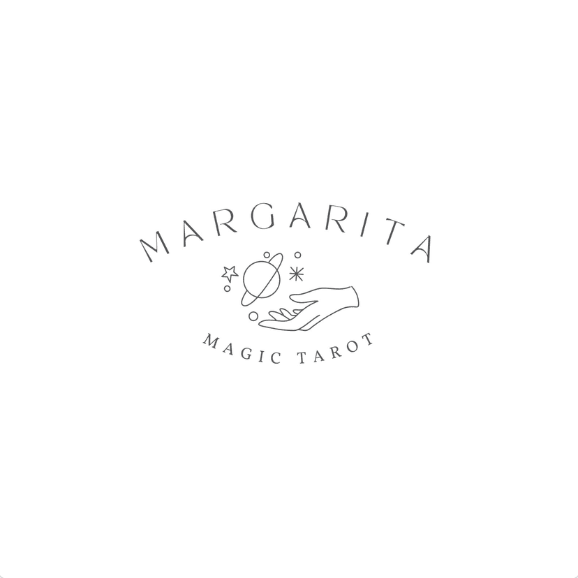
No critical fine lines
Thin lines, while beautiful, are hard to read at a distance and in scrolling environments like social media.
Fine lines are lovely as a detail, but risky as the whole idea. If the moon's face, card border, botanical stem, or even the reader's name disappears when the logo is small, simplify it. The mark should still feel intentional without its most delicate strokes.

Legible at a small size
Interesting formats like round badge logos when small become blurred and illegible.
Your logo will often be seen as a profile circle, shared-link preview, or small page header. Choose type with enough presence and a main shape you can recognize at about 40 pixels. Check that it still works as a compact icon without relying on the full-size composition.
The pieces can work on their own
Choose a template whose graphic and wordmark can work independently: the symbol as a profile icon, the name on an offer, and a small motif carried into social posts. Moon Crow shows what that looks like when the parts are separated.
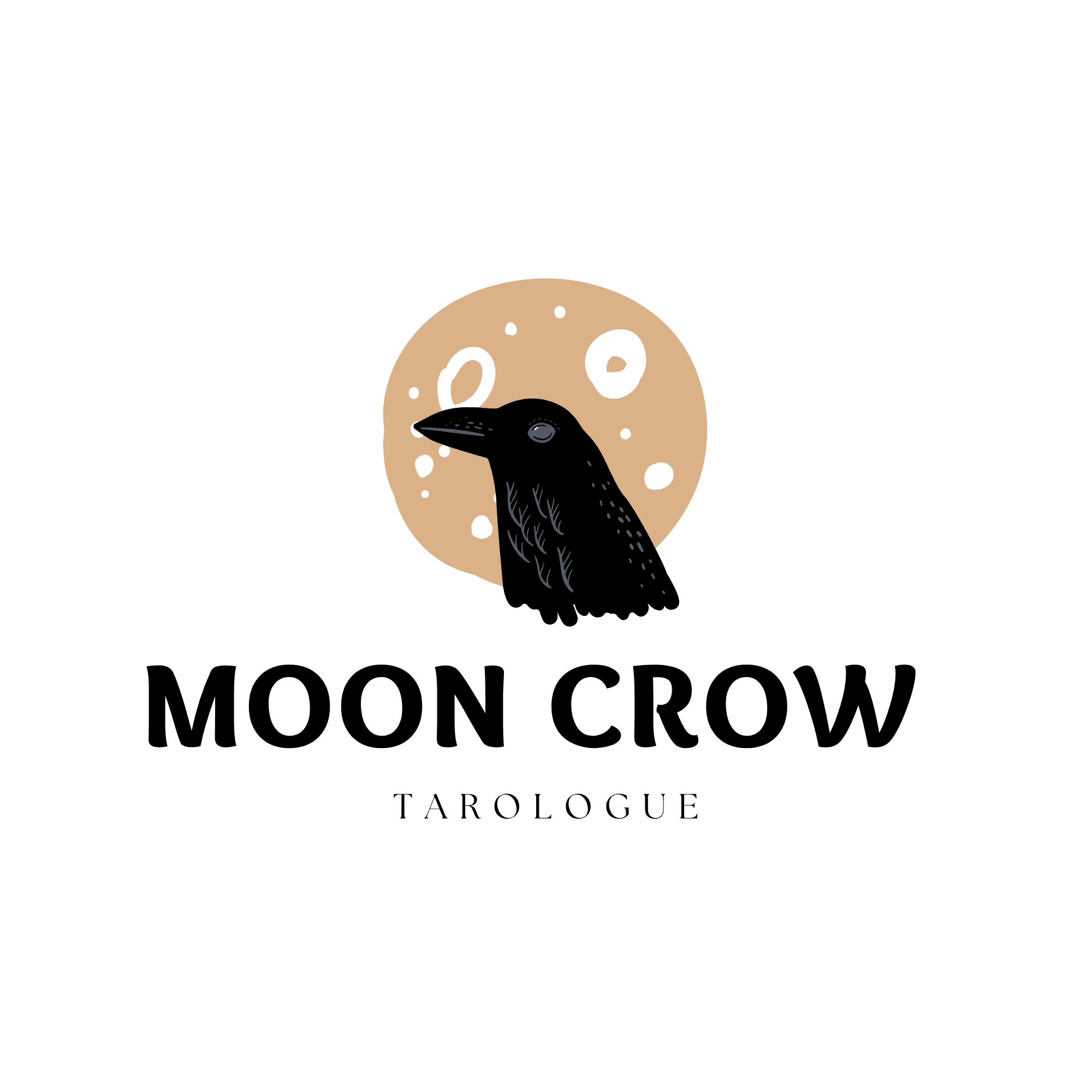
Full logo
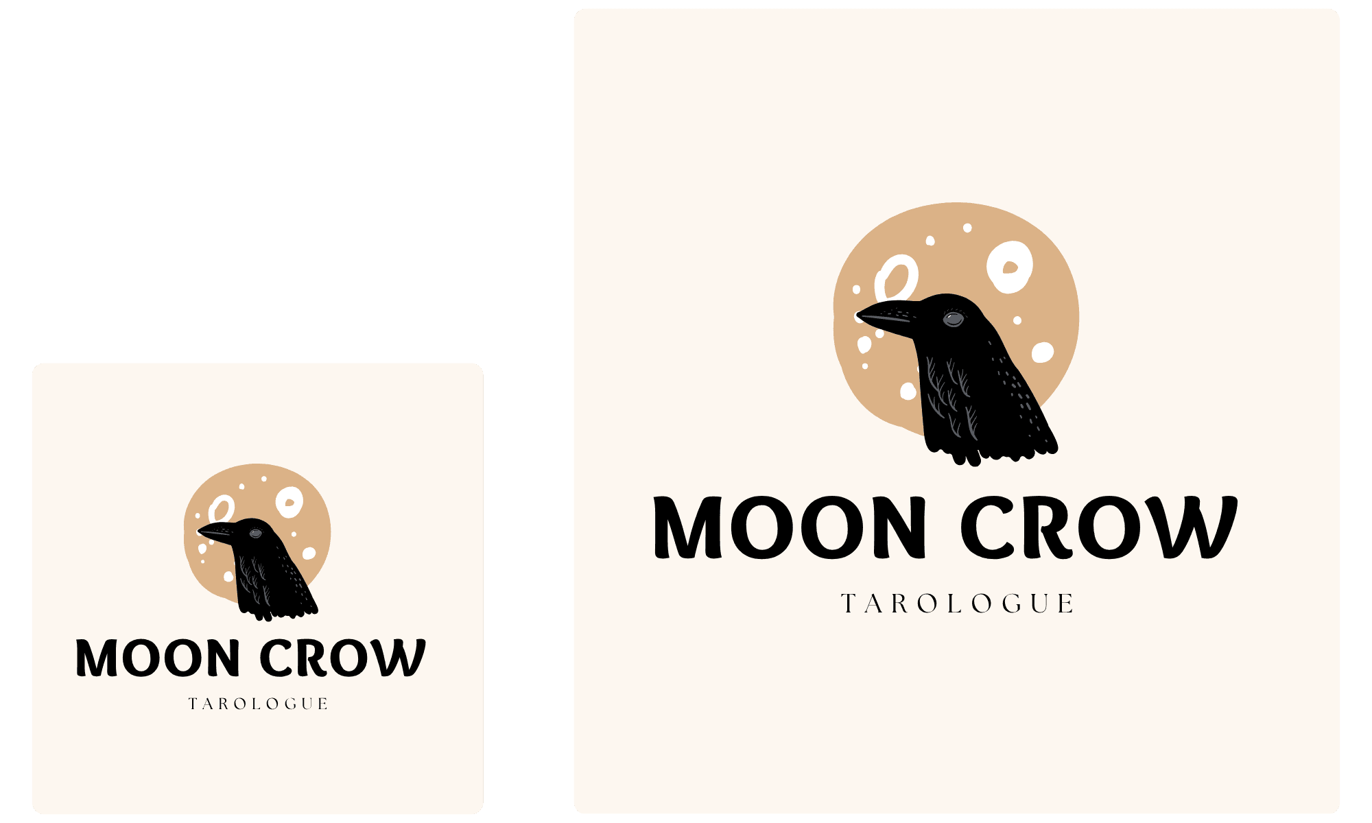
Small-size test

Graphic only
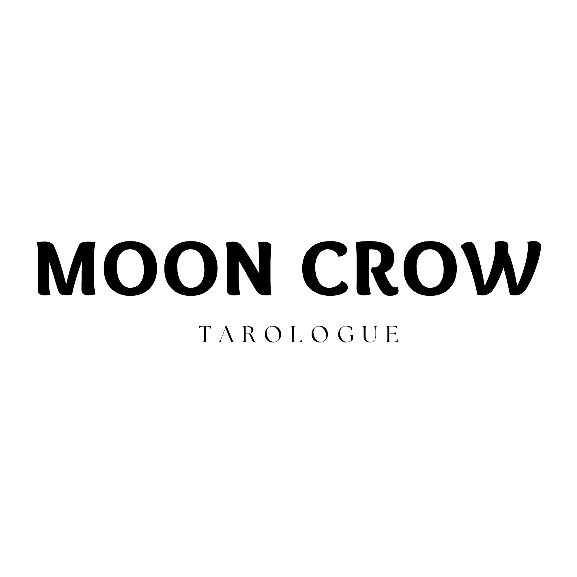
Text only
The graphic can become the profile image, the wordmark can sit on an offer, and the two together remain the full logo. A useful template gives you more than one way to show up.
The small-size test I use before calling a logo finished
Do this before you publish the logo anywhere:
Reduce it to about 40 pixels high. Can you still read the name or recognize the icon right away?
Put it in a circle. Most social platforms crop profile marks this way. Check that the essential shape survives.
View it at normal phone distance. Do not judge it while enlarged at 400% in Canva.
Place it on light and dark backgrounds. Keep a light and dark version if the mark needs them.
The same principle matters when you use the mark on a Mini Website or reading page. Clients should recognize that they are in the right place before they need to study anything.
Turn one template into a small brand system
For the template you choose, make a small folder with:
- A full logo. The practice name and main graphic together.
- A compact wordmark. The name on its own for headers and social posts.
- A profile icon. Only the strongest graphic or letterform.
- Light and dark versions. For backgrounds where the main mark does not hold enough contrast.
- Separate graphic and text files. So each piece can be used where it fits best.
- One recurring detail. A small motif or texture for offers and social graphics.
You do not need to put the complete logo in every design to make the practice feel coherent.
How I would customize a good starting template
Once you have chosen a template with good bones, make these changes in order:
Replace the sample name with your real practice name. The name should lead the composition.
Choose type that fits your visual direction. Check that it remains readable at a small size.
Reduce the symbol to its clearest version. Remove details before adding new ones.
Build a simple light and dark version.
Create the small icon as a separate mark. Do not shrink the entire wordmark into a circle.
Try it where clients will see it. Check your social profile, Mini Website, offer page, and a reading delivery.
A logo is not finished when it looks right in the editor. It is finished when it helps someone recognize your practice wherever they find it.
For starting points you can open in Canva, see my favorite Canva logo templates for tarot readers. For ideas about where a mark fits in your client experience, see what tarot reader software should help you do.
The short version
Choose a Canva logo template with a clear name, enough visual weight, no critical fine lines, and a shape that survives being small. Make sure its graphic and wordmark can stand on their own, then adapt its type, color, and spacing to your practice.
Frequently asked